Value Management: What’s in a Logo?
Our logo hasn’t changed in 35 years, and it shows a triangle with six levels, with a line running through all of them. This describes everything we were founded to focus on and everything we do now – in particular, achieving simplicity the other side of the fault line of Complexity.
How often do you really look at a logo and think if it “means” anything and, if so, what?
Next time you see the Amazon logo, for example, notice (if you hadn’t already) how the arrow:
- Goes from the a to the z: Amazon sell everything.
- Is curved to resemble a smile, likely to hint at positives like satisfaction.
- Adds a dynamic element to the logo, hinting perhaps at speed.
Our Value Management logo is such a logo, telling the story behind the formation of New Information Paradigms (NIP) – the company behind Value Management – and of everything that we’re about.
The “Levels” of the Logo
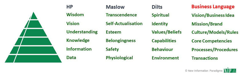
NIP was founded in 1989 by two ex-Hewlett Packard employees – one of whom remains as director – who could see the long-term value of managing the full “spectrum” of information (i.e. a “new information paradigm”).
This spectrum can be represented in the following hierarchy of “levels” (a framework that was originally developed for HP), “highest” to “lowest”:
- Wisdom
- Vision
- Understanding
- Knowledge
- Information
- Data
NIP then harmonised these “levels” with Maslow’s Hierarchy of Needs and Dilts’s Logical Levels to form the “levels” of our logo, and also expressed the “levels” in business language for ease of communication:
Proving the robustness of the structure, we’ve since found that many other models for describing how “systems” work also naturally “fit” – “systems” being the broadest possible term to encompass individuals, organisations and even Ecosystems.
How These Levels “Work”
These levels involve four key “dynamics” and “features”.
Firstly, each level both guides and influences the level(s) below it (e.g. transactions are guided and influenced by processes and procedures).
Simultaneously, each level is also a distillation of, and more Complex than, the one below (e.g. identity is at the core of values and beliefs; culture is more Complex than competencies; etc).
As indicated by the small gaps between levels, the transitions between them involve transformation and different kinds of activity, and these transitions pose challenges in both directions (e.g. there is “translation” needed on the way “down” and learning needed on the way “up”).
Secondly, change at the “higher” levels in the logo – whether for an individual or an organisation – is typically slow and harder, whilst change at the “lower” levels is typically faster and easier.
For example, an organisation is more likely (and finds it easier) to change its processes and operating model more often and faster than its brand or mission; people are less likely (and find it harder) to change their core values than they are their daily routines. And so on.
Thirdly, “systems” and the challenges they face can be expressed in terms of how many “levels” are involved, affected or “impacted”:
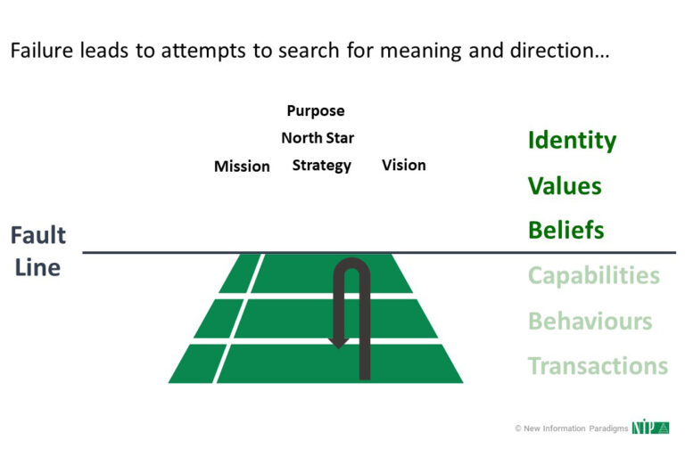
Significantly, the challenges of today’s turbulent environment increasingly reach further “up” the levels:
- Historically, the threshold of competition was primarily at “lower” levels, prioritising efficiency and optimisation.
- However, efficiency by definition optimises what is known and already in place – i.e. it is developmental, focused on the objective, the comfortingly familiar and the already known.
- With Complexity, emergent change is constant, “fuzziness” and subjectivity dominate both with means and ends, and optimisation is impossible (with attempts at it being counterproductive).
The threshold of competition, competitiveness and competitive advantage has therefore moved “up”.
And what we have then come to increasingly understand over the years is that there is a hidden boundary, or “fault line”, exactly halfway between the levels.
The Fault Line
This “fault line” becomes clearer when we map the ways that “systems” and challenges can be described in terms of the levels (see “Thirdly…” above), and note the introduction of a second “Simple” – simplicity the other side of complexity (we’ll come back to this shortly):
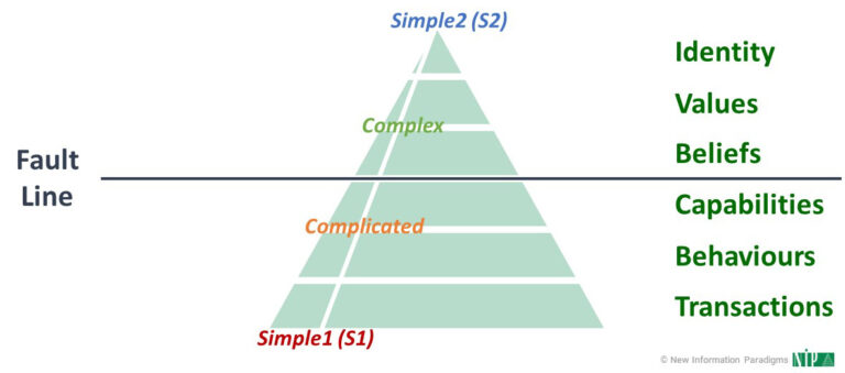
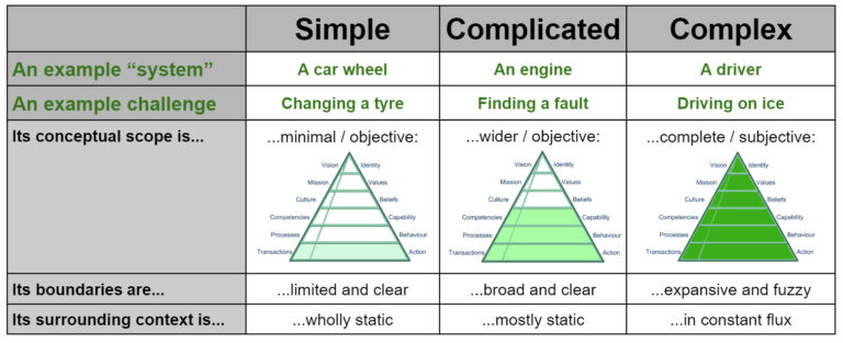
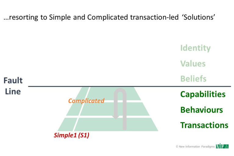
The “fault line” is the boundary between Complicated and Complex.
After all, the principal difference between Simple (1) and Complicated is linear and one of scale; it may be very difficult, and involve a lot of work, but ultimately something Complicated is nothing more than the sum of its Simple (1) parts:
- Its surrounding context and circumstances are (near) static.
- It can be bounded, analysed, understood and precisely described.
- It operates to cause-and-effect rules that can be discovered and controlled.
- Specific aspects can be isolated and dealt with independently of the others.
- It can be readily and repeatedly observed, with success objectively defined.
In contrast, though, whilst Complicated and Complex are mistakenly used as synonyms, the differences between them are seismic and multi-faceted, and the linear progression along the spectrum so far is shattered.
Trying to show this non-linearity in the logo wouldn’t have been possible – there are limits to how much you can convey in one graphic – but this is where the whole is always (far) more than the sum of its (Simple and Complicated) parts:
- We go beyond the known / knowable to also encompass the unknown / unknowable.
- We move from the linear, hierarchical and bounded to the networked, interdependent and fluid.
- Subjectivity is introduced and a threshold of autonomy crossed.
- Change is no longer proportional but exponential.
- Repeatability is mostly eliminated.
- The relationship between effort and result is severed.
This “fault line” may be even more profound in reflecting the natural biological boundary between brain hemispheres.
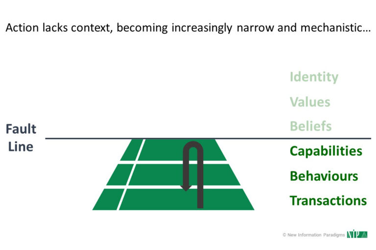
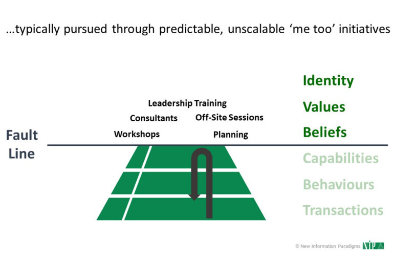
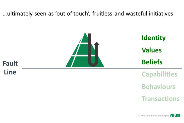
Either way, the tendency is to shy away from and “bounce” off it as we find challenges pushing us towards it, and the levels “above” the “fault line” are then seen as out of touch, fruitless and wasteful:
What is needed is something that can “straddle” that “fault line”, and now we return to our logo design.
Value Management and the Things That Matter
This is where we focus on the remaining element of our logo: the line that runs parallel to the left edge.
This line recognises the need to straddle the boundaries between levels – making the transitions between them that we mentioned above seamless – and to unite them.
This line represents the solution: Value Management:
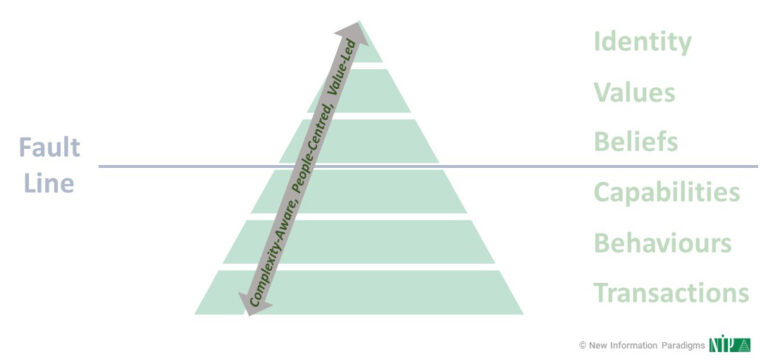
Value Management:
- Complexity-aware, People-centred and Value-led.
- Surfacing, focusing on and progressing the Things That Matter, expressed as appropriate at the different levels.
- Value Codes to make the subjective and intangible measurable, as well as the objective and tangible.
Value Management unifies and harnesses the previously (potentially and often actually) competing forces on either side of the “fault line”:
- Below it is the domain of action and reductionism; this is the area where we will increasingly see Artificial Intelligence making huge contributions to.
- Above it is the domain of understanding and holism; this is the area that only humans can effectively operate within – the area of discernment, passion, responsibility and instinct.
And this is where – the other side of Complexity – we find the other Simple (2): simplicity the other side of Complexity.
So, What’s In A Logo?
In the case of our logo, pretty much everything. It:
- Reflects the original inspiration behind our foundation, recognising the spectrum of structured and unstructured information that needed to be served.
- Encapsulates how people and organisations “work” – their inner structure and the dynamics inside that structure.
- Can be used to model, describe and explain the increasingly profound challenges we all face.
Most of all, it also shows the solution that brings it all together: Value Management.

